Walk into any modern retail space, museum, trade show, or corporate lobby and you’ll notice something: the best displays don’t just “sit there.” They perform. And more often than not, the difference between a display that blends into the background and one that pulls you in comes down to lighting.
That wasn’t always the case. For years, display design leaned heavily on bold graphics, clever copy, and physical craftsmanship. Those elements still matter—but today’s audiences are more visually literate, more distracted, and more demanding. Lighting has become the quiet force that shapes attention, communicates quality, and even influences whether people trust what they’re seeing.
Lighting is no longer decoration—it’s communication
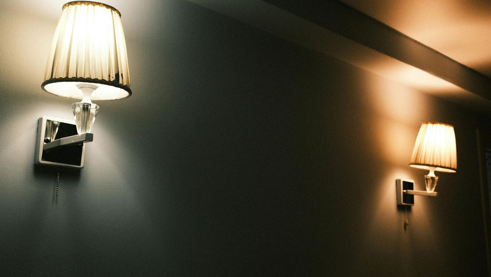
A display is a message, and lighting decides how clearly that message lands. The same printed graphic can look premium or cheap depending on how it’s lit. The same product can read as “clinical” or “craft” based on colour temperature. The same installation can feel calm or frantic depending on contrast and glare.
Think of lighting as a design language with its own vocabulary:
- Brightness influences urgency and legibility.
- Contrast directs the eye and creates hierarchy.
- Colour quality affects realism (especially for skin tones, food, and textiles).
- Uniformity signals professionalism; patchy hotspots suggest “temporary” even if the build is not.
In other words, lighting isn’t an add-on. It’s part of the narrative. If your display has a single job—get someone to notice, understand, and act—lighting is often doing the heavy lifting.
The shift to experience-first spaces
One reason lighting matters more now is that physical spaces are increasingly judged against digital ones. Online, everything is backlit, crisp, and consistent. In person, people still expect clarity—but they also want atmosphere.
This is why experiential retail has leaned hard into lighting design: it’s the fastest way to cue emotion and behaviour without changing the footprint. Want to slow people down? Reduce glare, soften transitions, warm the palette slightly. Need to create a sense of momentum? Add contrast, punch up key focal points, and keep peripheral areas quieter.
Human-centric expectations (and less tolerance for visual fatigue)
Another change: people have become more aware of how environments affect them. Harsh overhead lighting, flicker, and excessive brightness are no longer “normal”—they’re irritants. In busy venues like airports, shopping centres, and exhibitions, visual fatigue is real. Good display lighting respects attention rather than attacking it.
That means the best-designed displays now consider comfort alongside impact: controlled glare, stable output, and lighting choices that don’t distort the content.
Sustainability has moved from “nice” to non-negotiable
The other big driver is sustainability—both ethical and regulatory. Brands and venues are under pressure to reduce energy use, streamline maintenance, and avoid wasteful, short-life components. Lighting is a practical place to start because it’s measurable and visible.
LEDs, better diffusers, smarter drivers, and modular systems have made it possible to build high-impact displays without the old trade-offs (heat, frequent replacements, high power draw). If you’re exploring options in that direction, solutions designed specifically for energy-efficient promotional signage can be a useful reference point—particularly for understanding how even illumination and lower running costs are achieved in real-world display formats.
The important thing is the mindset shift: the question is no longer “How bright can we make it?” but “How can we make it effective with the least energy and the longest service life?”
What separates “bright” from “well lit”
Brightness is easy. Good lighting is technical.
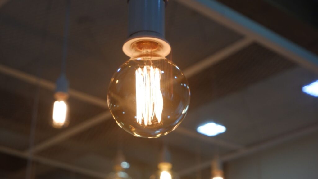
Colour temperature and brand perception
Colour temperature (measured in Kelvin) shapes mood and perceived quality. Cooler light (5000K–6500K) often feels crisp and modern; warmer light (2700K–3500K) feels inviting and premium. Neither is inherently better. The trick is matching it to:
- the product (food, cosmetics, apparel, electronics all behave differently),
- the venue lighting (your display shouldn’t fight the room),
- and the brand tone (minimalist vs. artisanal, playful vs. luxury).
A common mistake is mixing colour temperatures unintentionally—e.g., a cool-lit graphic beside warm-lit shelving. Even if the design is strong, the overall impression becomes “off.”
CRI: the silent deal-breaker for print and product
CRI (Colour Rendering Index) is how accurately a light source reveals colours compared to natural light. Low-CRI lighting can make reds look muddy, skin tones look flat, and premium materials look dull. For displays, especially printed graphics, aiming for high CRI is one of the simplest ways to protect design intent.
Glare and hotspots: why diffusion matters
You’ve probably seen a backlit display with bright bands, corner hotspots, or a “halo” effect. That’s not just an aesthetic issue—it affects readability and trust. Uneven light signals cheaper construction, and viewers subconsciously discount what they’re seeing.
Diffusion quality, LED spacing, and internal reflectivity all influence uniformity. When these details are handled well, the viewer stops noticing the light source and starts engaging with the message.
Practical lighting choices that raise display performance
You don’t need a complete redesign to improve results. Often, small technical decisions create the biggest lift.
A quick checklist for better-lit displays
Use this as a sanity check during design and installation (and yes—measure where possible, don’t just “eyeball” it):
- Define the goal first: Is the display meant to stop traffic, support browsing, or guide wayfinding?
- Control hierarchy: Light the focal point, quiet the secondary information.
- Match ambient conditions: A display that works in a dim lobby may wash out in a sunlit atrium.
- Prioritise colour quality: High CRI for anything colour-critical (print, food, skin tones, textiles).
- Avoid glare at eye level: Especially for glass-fronted frames and glossy substrates.
- Plan maintenance access: A great display that’s painful to service becomes a cost problem fast.
(That’s the only list you need—after that, it comes down to testing and iteration.)
Lighting is now a competitive advantage
Here’s the bigger point: lighting has become one of the few remaining “unfair advantages” in display design. Many environments are saturated with messaging. Most brands can print high-resolution graphics. Plenty can build attractive structures. But fewer invest in lighting that’s intentional, comfortable, sustainable, and consistent across sites.
When lighting is handled with care, it quietly improves everything downstream:
- graphics look sharper,
- materials look more expensive,
- photos and social content come out better,
- and the space feels more considered.
So if your next display brief is focused solely on size, copy, and placement, it may be worth asking a different question: How should this be lit to do its job—beautifully and responsibly? That’s where modern display design is heading, and it’s why lighting matters more than ever.